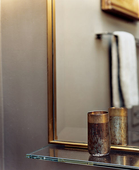
We all know I'm a sucker for real estate, especially real estate that's in New York City. As much as I would like to say that I'm a Manhattan-kind of guy, my budget most likely wouldn't stretch very far on such a expensive island. So what's a boy to do? Move to Brooklyn, that's what. Obviously due to a depressing case of unemployment and budgetary limitations, I am in no way moving to NYC, but I can imagine. And I will imagine myself in the Williamsburg apartment of Jared Geller, bi-coastal music producer, recently featured in Working Class magazine.
Showing posts with label interior design. Show all posts
June 24, 2013
Dreaming About Williamsburg
We all know I'm a sucker for real estate, especially real estate that's in New York City. As much as I would like to say that I'm a Manhattan-kind of guy, my budget most likely wouldn't stretch very far on such a expensive island. So what's a boy to do? Move to Brooklyn, that's what. Obviously due to a depressing case of unemployment and budgetary limitations, I am in no way moving to NYC, but I can imagine. And I will imagine myself in the Williamsburg apartment of Jared Geller, bi-coastal music producer, recently featured in Working Class magazine.
October 5, 2012
Steven Grambel Does Tudor
Tudor architecture is an acquired taste, it does not please everyone, but it sure pleases me! I think Tudor style homes are whimsical in a masculine way; the usually dark interiors are equipped with generous spaces and beautiful details. Steven Gambrel took on the job of renovating a young family's home in Bronxville, New York, and completely overhauled the space having respected history, but not being a slave to it. Mr. Gambrel completely reworked the entire house, changing the layout, and even stripping original finishes on the house, but then filling the house with even more original details that make the house a unique home that will stand the test of time. The English-Tudor was in desperate need of repair and a serious attention to detail, so Mr. Gambrel took to filling the home with many of his own custom-designed furnishings, and also giving the home a totally new color palette. The soft blues, the owner's favorite color, are seen everywhere throughout the house, including the exterior. A pale blue color was applied to the half timbers for a lighter effect on the exterior, making the home inviting even from the street. I think Steven Gambrel is a complete visionary and can take any space and make it truly special.
October 1, 2012
Phillip Gorrivan
The Upper East Side of Manhattan is home to so many great apartments, new and old, and you will a lot of times find an old apartment that has been converted to look brand new. Interior designer Philip Gorrivan and his wife, Lisa, share their Carnegie Hill apartment with their children, Charlie and Isabelle and found their perfect apartment(s), and made it into their own. No expense was spared when renovating and combining two apartments, one being a two bedroom, and the other being a one bedroom, into a family friendly three bedroom. You can watch Mr. Gorrivan giving a personal tour of his apartment on ElleDecor.com. Be sure to notice Mr. Gorrivan's impressive art collection; a mix of photography, drawings, and paintings cover the walls, leaving me envious.
September 17, 2012
Luxe in London
London's calling! Just kidding. But this London townhouse is definitely calling my name. If I could live anywhere in the world (not including New York City), I would choose London. Frankly because I like their accents, and the smugness that comes along with it; plus those accents are actually spoken in English, which is a plus for a unilingual person such as myself. Like my language palette, I like my living space to be clean, and without a lot of fuss, but stacked with style. This London home, was designed by none-other than John Minshaw, an award winning British architect and designer. The soft white color scheme makes the space comfortable, but still giving it that museum quality formality ... Work with me here, it's like living in a really casual museum. It's perfect for entertaining, or a quiet night in front of the many fireplaces. Also, the scale of the rooms compared to the furniture placed in them is really quite intriguing. The rooms aren't large in square footage, but the ceiling heights are in fact far reaching, so the furniture staying low makes each room feel lofty. Lofty, just like my ambition to live in a house like this one day.
August 13, 2012
A Home From Meatballs
Let's talk meatballs. The Meatball Shop is a New York treasure that serves up the tastiest balls in the city. Even though you can eat at three different Meatball Shops around Manhattan, the owner/couple call Brooklyn their home in this comfortable and bright apartment. Michael Chernow and Donna Hemmingsen may be one of the most attractive couples ever, but their apartment is just as attractive... along with their dog who is also cute-to-boot. The couple's apartment has classically bright and white walls that are filled with precious trinkets from years of collecting flea-market steals, all with dark wooden floors that bring the airiness down to a grounded feel. Michael and Donna are serious collectors of all things old and that probably no one else has; they spend their weekends at their home upstate, finding the best vintage items to scatter around their urban dwelling. The interior of this home is beautiful, but it is certainly complimented by the gorgeous city views seen from the rooftop that is big enough for entertaining... a lot of people! But as big as the roof is, the couple prefer to keep it intimate with only a few people at a time. I can't tell if I'm salivating over this apartment, or for a meatball sandwich.
July 25, 2012
Hampton Showhouse Part III
One of the main reasons I would ever want a home in the Hamptons is to host guests throughout the summer. And with this guestroom, designed by Katie Leede, I would most certainly not be ashamed to put any guest up in here. The soft blue moldings on the paneling along with the coffered ceiling beams are the perfect compliment to the blue and green pattern on the wallpaper. The upholstered headboard is the perfect opposite to the sleek and modern glass-topped desk across from it, both making the room feel contemporary but comfortable. This mature guest room is definitely for the parents of the children that are staying across the hall... See below.
And don't forget to check back on Friday for the conclusion of the Hampton Design Showhouse coverage, all brought to you by Traditional Home.
July 23, 2012
Hampton Designer Showhouse by Traditional Home
Having only a few weeks left in New York, I was ecstatic to get the opportunity to visit the 2012 Hampton Designer Showhouse in Watermill, NY this weekend, presented by Traditional Home. The Hamptons are as chic as they come, so who better than Heather Clawson of Habitually Chic to trek out to Long Island with on the beautifully sunny Saturday afternoon? And boy, did we have a blast! The home is beautifully decorated by some of the country's top designers, which is ever so apparent in the design of the home. Series of rooms will be posted throughout the week, starting with the foyer, dining room, and living room.
July 18, 2012
Chilly White in the Hot Summer
It's humid as hell in New York City, and there's really no better way to cool down than to look at pictures of an icy-white apartment in Skåne, Sweden... or you could probably just eat some ice cream too. Either or, your choice. This nordic-inspired interior is grounded by dark wooden floors, topped with bright white walls that are made even brighter by the natural light flowing through the white curtains. The area's brightness makes the space feel fresh and bold. Although the white walls and contemporary furniture pack a punch of modernity, the scattered artwork on the walls and resting against the walls make the room feel lived-in and comfortable. The lack of color used in the space isn't so much apparent because there's texture throughout, especially with the natural elements placed around the apartment, like the wooden block side table, and the plants used in each room. This space would be warm and inviting during the winter months because the white palette would compliment the snowy weather, while the same space in the summer is oddly refreshing from the stark white walls.
June 6, 2012
Bad Ass Bohemian
"You look like an unmade bed" is probably one of the harshest things I've said to someone lately, but in actuality, is it that bad? If you've read any of my many posts on beds... you'll know that I'm a sucker for an unmade bed. Now you won't find my bed to be unmade anytime soon though; that's just lazy. But back to my point, a poked and prodded bed or home can many times look quite comfortable, and dare I say, chic? Take the increasingly trendy style of bohemian chic design, it's basically the teased hair of interior design. A little wild, a little unkempt, but pretty cool nonetheless. You can walk into a bohemian style home and be captivated by the askew pictures on the walls and floor, and the thrown ever-so-perfectly throw over the back of the couch, or even the pillows laid on the floor, offering alternative seating, which I personally think is pushing it; if I visit your house, I will most likely be resistant to take off my shoes, and sit on your floor. Now don't think anyone can get away with having a bohemian style home if you don't do your dishes and forgot to scrape your unmentionables off the bathroom floor. It takes a certain sense of style and prowess to achieve such a haphazard scheme.
May 9, 2012
Don't Lose Your Marble(s)
Just like a tale as old as time, marble is a material that will last forever. In style and in construction. Marble used to be the go-to stone to lay on top of your kitchen cabinets, but then much to my dismay, granite came along and blew marble and its beautiful veins right out of the water. Although granite still reigns as the trendy (and most practical) choice of counter top, marble is making a comeback in other areas of the home. Everything from wall consoles, to coffee tables, or (the most traditional alternative) dining tables, marble-topped furniture is completely awesome. Considering that it is a slab of natural stone, it brings a certain sturdiness to the furniture, but with its light and subtly detailed colors, it's also fresh and airy. Seeing some of these dining tables makes me want to have a dinner party, but that would mean I need to get a dining room, with a table, and food to serve, and friends to host, which I have none of those things. So...
May 3, 2012
Warm Weather Leather
You know when something is aged just right? Good, because I don't - I'm a fresh-faced twenty-one year old that gets distracted by all things new and shiny. However, when I take breaks from starring at mirrors and disco balls, I have noticed the beauty in aged buttery leather. I'm not entirely positive 'buttery leather' is the correct terminology for what I'm featuring today, but just go with it. These lightly colored pieces of leather furniture have been making me sigh whenever I see them, and The Sartorialist's, Scott Schuman's recent self-portrait (see last picture) got my motor going. I finally went on a rampage of all things buttery and chic. The pictures below, including the one of the smelly shoe, really make me ooze with desire. It could just be the weather, but I am just drawn to the lightly colored supple
May 2, 2012
Approaching Tacky in Boston (again)
Due to technical difficulties on my end, this feature was supposed to be posted last week, but because of my inept ability to do anything right, only the title was posted. Sincerest apologies. No wonder no one supports me buying a puppy. Anyway, in the midst of my slow demise that is the end of the semester, I found something to pull me out of my funk, and that was Glossed&Found.com. It's a snappy little online magazine that features short videos of cool people who live in and visit Chicago. I spent an entire night gorging on pasta and watching just about every video in their archive; they've interviewed some pretty great people, Simon Doonan, Kelly Wearstler, J.C. Steinbrunner, Corri McFadden, and naturally Ms. Piggy opted for an interview too. Almost all of the videos are hosted by Graham Kostic, the creative director of the site, who is just as funny as he looks. So while poking and prodding around the interweb, furthering my knowledge of Mr. Kostic, I came across his sweet little apartment in Boston. The tiny pops of color throughout are perfectly grounded by the classic color palette, all while being offset by the corky accessories scattered throughout. Notice I say corky; corky is the last stop before tacky. And I say that with great admiration, because the Gram and his partner, Fran made that same statement, 'We stop right before it gets there.' The home was featured in Boston Home Magazine back in September - I know, we're late to the party, but anybody that reads this blog shouldn't expect much. Graham and Fran recently moved back to Chicago, into an old soda pop factory, no less (why wouldn't they?), so I'm sure we'll all be anxiously awaiting another peek into their new home in Chicago.
April 3, 2012
92nd Street Carriage House

This renovated carriage house on East 92nd Street in Manhattan has New York sophistication with a modern twist. The 25-foot wide carriage house has had a gut renovation, which lasted two years, but has the end result of a very modern urban dwelling with the look of a sophisticated boutique hotel.
The multiply-floor house has a number of rooms for gathering, but my favorite by far is the double-height library, with the floating bookshelves, and encased wood desk. I also really enjoy the dining room, with the circle table. In my opinion, it is hard to find circular tables in formal dining rooms, but I think they look luxe. Another thing I like about the whole house is the simple, yet worm color of the wood paneling that surrounds the fireplace.
As much as I like townhouses in New York City, I am still drawn to apartment or coops. I like the idea of a doorman, and the shared hallways, it's just so very New York.
March 27, 2012
Brick and Airy on the Parkway
Some might think it's a little wonky to say that this Chicago loft is just as beautiful unfurnished as it is furnished, but it totally is. The converted ballroom in The Ambassador East building on State Parkway in Chicago's Gold Coast, was stripped to bare bones (and bricks) to make way for a gigantic and airy three-level loft. This space encompasses an entire side of the building, allowing for maximum natural light to fill the cavernous room. The custom designed stainless steal kitchen is nestled in the front corner of the first floor, and exudes a certain sense of sexiness with the cold steal on the light and airy white brick walls. Come back tomorrow for a look at what the loft really looks like today, fully furnished, and nothing like Benoit Bertrand's creation from yesterday.
Photos courtesy of HomeDsgn.com
March 26, 2012
Rendered on the Parkway
Now you might look at these pictures and swoon over the beautiful furnishings and raw but chic details, but you will then be most likely be surprised to hear that this loft space is a complete digital rendering. After hours of investigating online, I finally pinpointed what the the concept behind this project from designer, Benoit Bertrand was. This loft does actually exist, but is not decorated like this. What really gets my motor running that I walk past this loft's building every single day. It's on the ground floor of The Ambassador East on State Parkway, directly across from Public Chicago, and looks absolutely intriguing at dusk when its light are on and you can barely see through the tall windows. Mr Bertrand decided to take it upon himself to render his own creation for the space, making it a warm and inviting space, that exudes calming colors and airy vibes. Stay tuned for tomorrow when I saw you the raw space of the loft, which is just as beautiful as it is (digitally) furnished.
Photos courtesy of Benoit Bertrand
March 23, 2012
Grey is Great
Many people might think that grey is a boring color, or not even a color at all, but I completely disagree. It's one of my favorite colors, because it cast so many different lights on a room. Take Francisco Costa's apartment in New York City that has a strictly grey palette. Mr. Francisco designed his entire apartment with a monotone color on the walls, but varied the other colors used throughout the apartment. The soothing grey color on the walls grounds the space, while his furniture and art adds interest. My all time favorite room of the apartment is the library, which ended up in my Animals in the Home post, but what I love most about that specific room are the two pictures mounted on the bookcase. I love when either pictures or sconces are attached to shelving. Take a look at the relaxing space, and notice that the bathroom door leading into the master bath is actually paneled to be hidden, pretty cool.
March 22, 2012
Stairway to Style
One of my favorite things about homes are the stairways that connect the different floors. Some people like to dress them up, others pretend like they're not there; there is so much that someone can do with the stairway that can compliment the space surrounding the steps. I am absolutely drawn oddly-shaped staircase (below), because they add so much interest to the space, but there is nothing I love more than a classic staircase with pictures on the walls ascending up. Hanging pictures, or any kind of art along the stairs is great, because it gives the space a personal feel, but with a sense of design and a collective atmosphere. Apartment living isn't really conducive for a stairway, unless you're sharing it with the whole building, but either way, I love taking the stairs.
New York City Townhouse
Aimee de Heeren's Townhouse
Brooke Astor's Country Home
New York City Apartment
Ralph Lauren Store, New York City
Kips Bay Decorator Show House
Connecticut Home
Top photo: Jeanne Greenberg Rohatyn's Townhouse
March 16, 2012
Luxe in The U.N. Building
A while ago, the New York Social Diary website did a House section on interior designer David Scott's UN Plaza Building apartment and it is absolutely wonderful. The mod 60s apartment is masculine, but still luxe and design-conscious. The location itself is one of my favorite parts of the apartment, being in the original building where the United Nations resides, which was recently featured in a book by Ben Murphy, called The U.N. Building. The book is an expose on the history of the building, ranging from the design of the building to the history-defining moments that took place inside (a definite must-read). But Mr. Scott's apartment is as noteworthy as the building it's in; the large space is great for entertaining, but still comfortable for a night in and ordering take-out. My two favorite parts about Mr. Scott's home are the geometric shelves in the entryway, a great display for books and other pieces of artwork, and what I really love is the Reinhard Görner photograph hanging above the sofa in the silver wallpapered alcove. I love the scale, along with just the simple image itself. The apartment is filled with great art, along with great furniture that fits the space perfectly, which will last throughout time.
Subscribe to:
Posts (Atom)